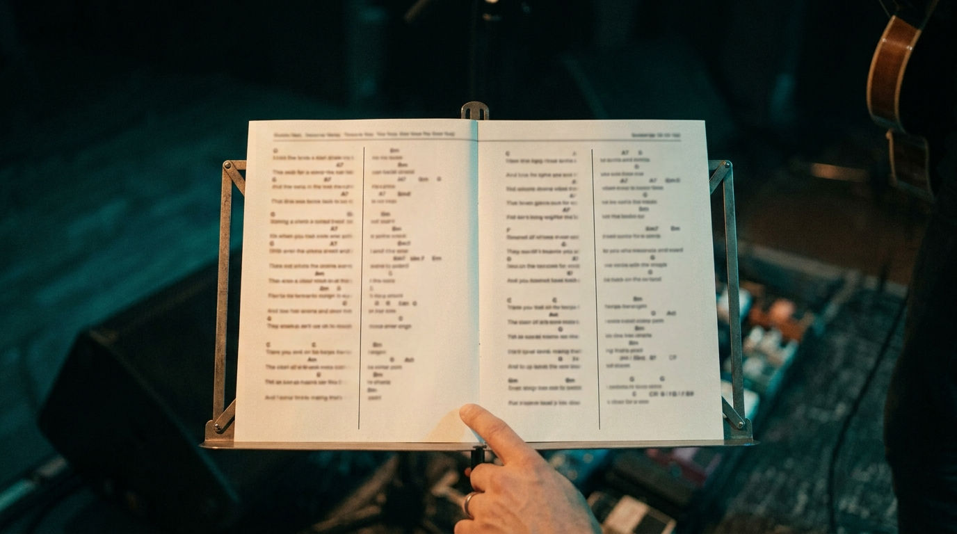
If you've ever fumbled a page turn mid-song, you already know why performers care so much about page count. A two-column chord sheet fits a whole song onto one printed page. It runs the verses and chorus in two side-by-side blocks instead of one long single-column scroll. The trade-off: a smaller font.
That trade-off is worth understanding before you use it. This guide covers when two columns make sense, how to format one so it doesn't look cramped, and the single most common mistake that ruins an otherwise good two-column sheet.
Key Takeaways
- A two-column layout fits more of a song on one printed page by trading font size for page count.
- Use two columns for print and gigs; use single-column on a tablet, where a larger font usually matters more than page count.
- Collapsing repeated verses/choruses to a header-only reference is the biggest space-saver (PraiseCharts, 2020).
- Wasted whitespace at the bottom of a column is a known, reported failure mode in at least one major worship charting tool.
What Is a Two-Column Chord Sheet Layout?
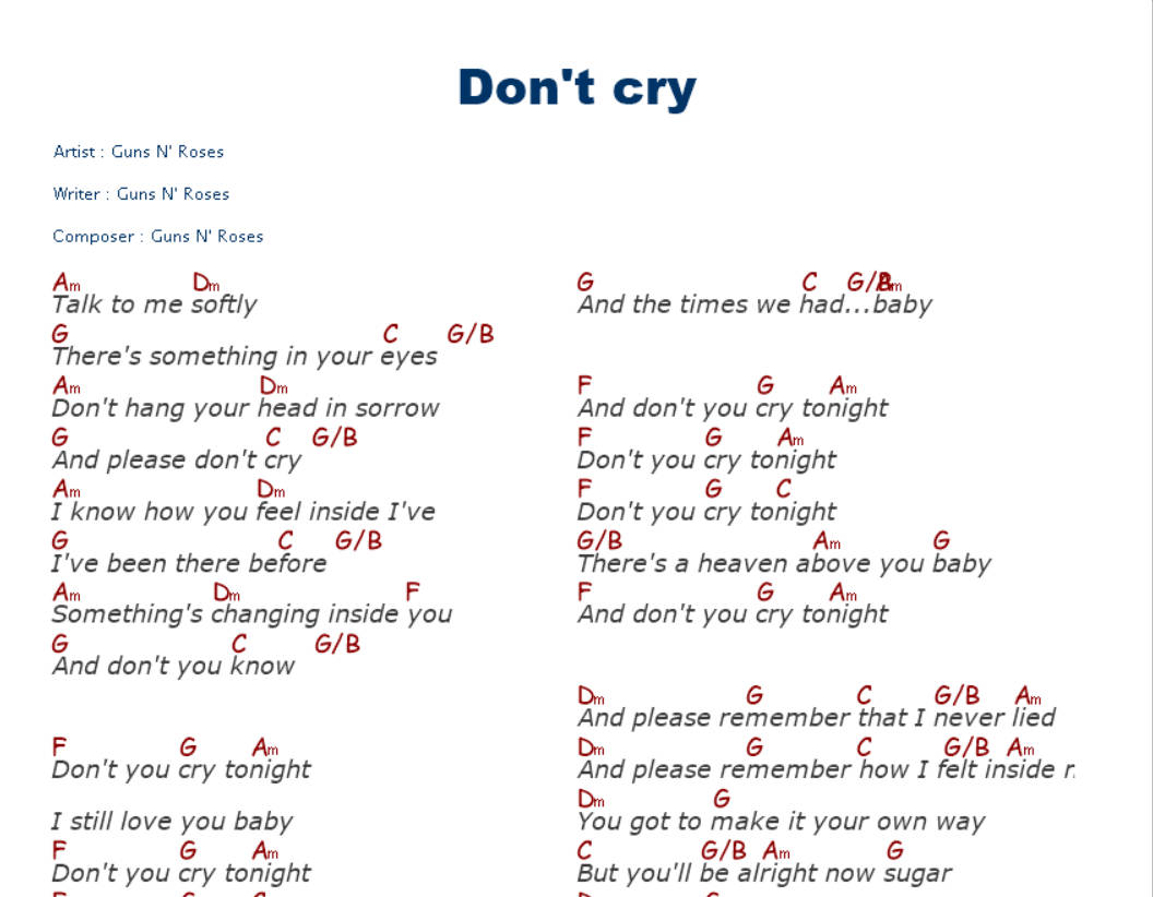
A two-column layout splits a printed page into two vertical blocks of lyrics and chords instead of one. A full song fits on a single page instead of spilling onto a second. This is the standard mechanism worship and performance charting tools use to compress a song onto one page, as WorshipTools documents in its own formatting guide.
The space doesn't come from font tricks. It comes from using the page's width, not just its height. A single-column sheet only uses the left half of a printed page. Two columns uses both halves. That's why a 2-page song often becomes a 1-page song once you switch.
That's also exactly why the font has to shrink. You're fitting the same amount of text into roughly half the horizontal space per line. Something has to give. It's always readability at a distance, not clarity up close.
When Should You Use Two Columns Instead of One?
Two columns make the most sense for printed setlists and live gigs, where every page turn pulls your focus away from the music. Single-column sheets are usually better on a tablet, where scrolling replaces turning and a larger font matters more than page count.
That's a genuinely different use case, not just a style preference. If you're reading from a stand or a binder, page count is the thing working against you. If you're reading from a screen you can scroll, page count barely matters. Legibility does. Chord Sheet Maker Online draws exactly this same line in its own formatting guide. Use 1 column for a larger font or tablet reading. Use 2 columns when you want as much of the song on one page as possible.
So ask yourself one question before you format anything: will this be printed, or read on a screen you can scroll? That answer decides the layout for you.
How Do You Format a Clean Two-Column Chord Sheet?
Three things separate a clean two-column sheet from a cramped one: font choice, consistent chord-to-lyric alignment across the column break, and how you handle repeated sections. Get those three right and the smaller font stops being a problem.
Font. A clean sans-serif such as Arial is the commonly recommended default across chord-charting tools, because it stays legible even when the two-column layout shrinks it down.
Chord alignment. Chords need to sit directly above the syllable where the change happens, on both sides of the column break. A chord that drifts even slightly at the edge is the fastest way to lose a reader's place mid-line.
Repeated sections. In 2020, PraiseCharts recommended collapsing repeated verses and choruses down to a section header rather than reprinting the full lyrics and chords every time they occur (PraiseCharts, Taking Chord Charts to the Next Level, retrieved 2026-07-05). That single change is usually the biggest space-saver in the whole document. Bigger than font size. Bigger than margins.
Here's a simple way to see why. Picture a song with 2 verses, a chorus repeated 3 times, and a bridge. That's 6 sections in total, but only 4 of them are unique. Print every repeat in full, and you're formatting 6 blocks of text. Collapse the repeats to header references, and you're only formatting 4. That's a third fewer lines, before you've even touched font size or margins. This is a worked illustration to show the mechanic, not a measured benchmark from a specific song.
The Most Common Two-Column Mistake (Wasted Space)
The single most common two-column failure is leftover white space at the bottom of a column. It happens when a song section doesn't divide evenly between the two sides. And it's not a hypothetical problem: users of at least one major worship charting tool have reported exactly this in the tool's own support community, describing empty space in the second column when the layout engine doesn't rebalance the split (WorshipTools community thread, retrieved 2026-07-05).
It happens because naive column-splitting just cuts the song in half by line count, not by section. A verse that ends three lines before the column break leaves those three lines blank. That's noticeable, and distracting, right when a performer glances down mid-song.
This is one of the reasons the two-column toggle in Chordastic accounts for section boundaries rather than splitting blindly down the middle of the page. It's worth checking this specifically in whatever tool you use: print a preview before a gig, not after.
Wasted space is the two-column-specific failure mode. For the broader list of chart-formatting mistakes — misaligned chords, missing header info, risky repeat notation, and more — see our full rundown of chord sheet formatting mistakes.
How Do You Create a Two-Column Chord Sheet in Chordastic?
Chordastic includes a built-in two-column toggle available in both the free and full versions. The layout itself is free to use. Only printing the two-column view is part of the full, one-time-purchase version.
Here's the short version: open Format → Two Column Layout, and the current song reflows into two side-by-side blocks immediately. Use the print preview to check the column break before you print anything. That's the fastest way to catch the wasted-space problem described above. For the full list of display and format settings, see the Chordastic manual.
For the full walkthrough on placing chords, autofilling repeats, and transposing, see our complete guide to creating chord sheets — this post assumes you're already comfortable with the basics and just want the two-column layout done right.
Frequently Asked Questions
Does a two-column layout make a chord sheet harder to read?
Font size drops to fit two columns on one page, so yes, there's a real readability trade-off. Use single-column on a tablet or whenever lighting, eyesight, or distance from the page make a larger font more important than saving a page.
What's the best font for a two-column chord sheet?
A clean sans-serif — Arial is the most commonly recommended default across chord-charting tools — keeps chord symbols legible even at the smaller size a two-column layout requires.
Can I mix one-column and two-column pages in the same set?
Yes, and most performers do. Use two columns for longer songs that would otherwise spill onto a second page, and single-column for short songs that already fit comfortably on one page without shrinking anything.
Why does my two-column chart have empty space at the bottom of a column?
This happens when a song section doesn't divide evenly between the two columns, and it's a reported issue even in established worship charting tools. Look for a layout that rebalances around section boundaries — or preview and check manually before you print.
Getting Started
Two columns trade font size for page count. That's right for print and gigs, not always right for a tablet. Get the font, the chord alignment, and the repeat-collapsing right. Then check your print preview for wasted space before you ever get on stage with it.
Chordastic's two-column layout is free to use in both the free and full versions, with printing included in the full, one-time-purchase version — no subscription. Download Chordastic for free and try it on your next song, or browse more screenshots first if you want to see the rest of the app.
Sources
- WorshipTools, Format, retrieved 2026-07-05, https://www.worshiptools.com/en-us/docs/68-format
- Chord Sheet Maker Online, The Basics, retrieved 2026-07-05, https://www.chordsheet.com/manual/basics
- PraiseCharts, Taking Chord Charts to the Next Level in 2020, retrieved 2026-07-05, https://www.praisecharts.com/blog/taking-chord-charts-to-the-next-level-in-2020/
- WorshipTools Community, Wasted space in 2-column view?, retrieved 2026-07-05, https://www.worshiptools.com/help/thread/6255170274983936